Archive | January, 2010

Visibone, a source of great reference guides and online utilities

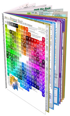
Visibone's Everything Book
One of my favorite tools for the past couple of years has been a web developer’s reference guide from Visibone. The book has rarely left my desk, within arm’s reach, to help out when I just can’t remember all the options for an HTML tag or a CSS style. While there are some great online references, having it all in a couple sheets of paper makes it easy to find what I’m looking for (especially if I couldn’t remember if it was text-something or font-mumble) and the reference has also let me browse around the dusty corners and learn something I didn’t know.

Recently, I did some web development using XHTML 1.1 and CSS 2.1 and realized my 2004 version of the guide was getting out of date. I was pleased to see many of the pages had been updated to a 2009 version. After reviewing the many options, I chose to go all in and bought the Everything Book, a step up from my earlier version. This one includes cheatsheets for PHP, MySQL, JavaScript, DOM, HTML, CSS, HTML special characters, web colors and a great index. The reference not only includes broad coverage of each topic but many side notes and compatibility guides (for CSS, the IE-Netscape-Opera-FireFox-Safari compatibility color coding is tremendously useful!)

There are a number of bonus references available on the Visibone site at no cost. Check out the color lab, the color swatches for many of the common graphics programs, the online color codes reference, and excerpts from all of the various reference materials. In addition to reference book, Visibone offers posters, charts and mouse pads. The web site is worth a visit; it’s charmingly quirky, retro, opinionated and clearly individualistic.

Semantic markup and styling of data entry forms, IE falls short

Somehow, in my 10 years of working with HTML, I had missed the fieldset and legend tags. I’ve just started in on a web site redesign where they can be used to great effect and nice semantic markup. The fieldset tag is intended to be used as a container for grouping related input items in a form. By default, the fieldset has a transparent background and a thin black outline around the fields. The fieldset can contain a legend tag that appears by default in the upper left corner of the black outline as a title for the grouping. Both elements can be be modified with CSS styles to match and complement the rest of the page design. Here’s the basic HTML snippet:

<form...>
 <fieldset><legend>Ship To Address</legend>
 <br clear="all" />

 <label for="Building_or_Hotel">Name of Building/Hotel:</label>
 <input type="text" id="Building_or_Hotel" size="25" maxlength="50" />
 <br clear="all" />
...
</fieldset>

And the applicable CSS to make the form look pretty includes:

/* Styles for legends, the title atop the fieldset */
.dataform legend {
 background-color:rgb(137,111,43);
 color:white;
 font-weight:bold;
 margin-left: 0.5em;
 padding:0 1em 0 1em;
 }
/* Fieldset groups a set of inputs in a visual container */
.dataform fieldset {
 border-color:rgb(137,111,43);
 border-style:solid;
 border-width:1px ;
 background-color: rgb(93%,89%,78%);
 }

Results in a data entry form that looks like this:
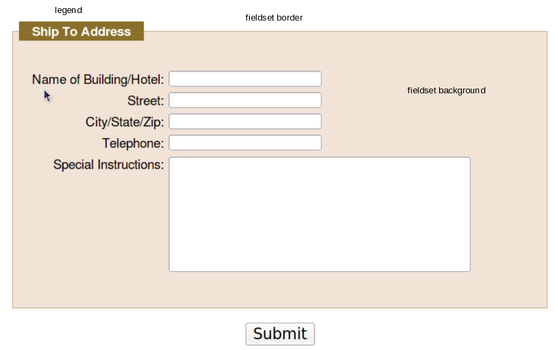
HTML form layout with fieldset and legend tags

Using CSS to add visual effects to the elements can yield some pretty sharp results while still having the speed and minimal bandwith of lightweight HTML and CSS text files. In addition, using the semantic fieldset and legend elements provides additional information about the form fields and their relationships in a machine-readable format, rather than just splattering a bunch of colored div boxes and styled text on the form. This is a great aid to tools used by the vision-impaired to provide more context to their users, and to search engines trying to derive the context of your forms.

Compatibility between different browsers is not too bad, though things could improve a bit. FireFox 3.5x, Chromium 4.0.285.0 (on Fedora, thanks, Spot!) and Safari 4.x appear dead-on the same (the screenshot above is FireFox 3.5.5), but there is an outlier and no one should be surprised to discover it’s Internet Explorer. Even in version 8, perhaps the most compatible browser Microsoft has shipped since the now-legendary IE5.5/Mac, things are just different. For some reason, the IE8 developers decided that the background color of the frameset should extend out over the border, to the edge of the legend, resulting in this less attractive appearance instead:

IE8 fieldset background colors overflow the border at the top.

For IE7, the background color doesn’t appear at all, which might actually be better than to have it appear incorrectly. (Update: no, my bad, it just doesn’t like rgb values expressed as percentages.) So the appearance definitely won’t be as sharp for your IE users as for any other browser user. (Yet another reason to encourage your clients, friends, associates, neighbors and strangers on the street to avoid Internet Explorer. We can eliminate it in our lifetimes.) (UPDATE: there are, of course, work-arounds. Here are a few suggestions that might work for you from Sitepoint and CommunityMX and Matt Heerema.)

So, the next time you’re called upon to draw up an HTML data entry form, keep in mind that you can group your elements with fieldsets and use legends to add more contextual information to your design.
“Web Form Design: Filling in the Blanks” – a review

WebForms book cover

Title: Web Form Design: Filling in the Blanks

Author: Luke Wroblewski

ISBN: 978-1-933820-24-8

Published by Rosenfeld Media, 2008

In the nineties, I used to do a lot of presentations at conferences of computer programmers. I used to enjoy doing “concept” presentations; not so much focusing on “how-to” as to “why” and “what” to do. When I set the audience’s expectations correctly that they were going to be exposed to new concepts, I got a good reception. When I failed to make that point clear, I would inevitably get comments in my speaker’s review of “Great idea, but where’s the code?”

If you’re looking for the code, look elsewhere. This is not the book for you. If you are looking for the concepts, the big ideas behind user interaction on the web, how to get information from the browser, how to successfully convert the most browsers into customers, why different alignments might make a difference in accuracy, speed and satisfaction in filling out forms, this is the book for you. Luke Wroblewski is an experienced professional in the field of HCI (“Human-Computer Interaction”) or UX (“User Experience”) with some impressive industry experience. This book shows a thoughtful approach to “how do I get people to fill out a form, quickly, pleasantly, correctly?”

So as not to get lost in the weeds of HTML vs. XHTML and CSS 1, 2, 2.1 and 3 varying levels of compliance, Luke talks forms purely from the user standpoint: we see excellent cropped screenshots of forms, focused on the individual elements under discussion. (Rosenfeld Media has done an excellent job of producing a beautiful book: heft, thick pages, rich colors and fine printing.) The book is divided into three sections: Form Structure, Form Elements, and Form Interaction. Each section assumes some base knowledge, thankfully, and doesn’t start out trying to explain why you’d use a checkbox vs. a radio button. And he’s frank that there rarely is One True Answer (at one point, calling out, “All together now: ‘It depends'”) but talks about empirical testing of speed, correctness, and the results of studies monitoring user’s eye movements, pauses and mouse movements to determine which layouts work and which confuse.

If you spend a lot of time designing forms, the 215 pages of this book are well worth a read, and don’t be surprised if you find yourself going back to the book for a refresher.

Everything You Know About CSS is Wrong! – A review

book cover

Well, almost everything

Authors Rachel Andrew and Kevin Yank almost lost me at “hello” with their book titled, “Everything You Know About CSS is Wrong!” ISBN 978-0-9804552-2-9. I’ve never liked the “Dummy’s Guide” book for the same reason — I’m not a dummy — and I’m fairly confident (and hope my clients are well aware) that my CSS knowledge, while not encyclopedic, is better than average, and I’ve delivered some fairly good web solutions.

However, the first goal of selling a book is to get attention, and the title surely does that. And the opening line of Chapter 1, “The problem with CSS is that CSS is too hard.” Okay, I’m hooked, reel me in. (By the way, you can download the sample chapter 1 & 2 from the SitePoint web site; start at http://www.sitepoint.com/books/csswrong1/)

The reality is that the book shows one of the newest features, now available in all of the current brand of browsers, with the late release of Internet Explorer 8, of table layout options in the display attribute. After years of preaching that HTML table layout is less desirable than CSS layouts, this can be a hard sell, but Rachel and Kevin make a good case that a tabular layout of tables, rows and cells, but rendered from CSS and not HTML, is the best of both worlds. Chapters 3 & 4 show the equivalent layouts of many of the common design problems we run into (and perhaps fall back to using tables) and how they should work both with the new CSS 2.1-complaint browsers and how to fall back gracefully into a degraded but workable layout for earlier browsers. Chapter 5 gets into some very exciting layout possibilities that will be coming in the next couple of years as the CSS3 specification gels.

A big plus for the book is that it is brief: 111 pages you can get through in one or two sittings. The graphics clearly show the developing examples. The code extracts are clear (and all the sample code can be downloaded from the web sites). And the writing is clear and well-edited.

The book is well worth the $29.95 cover price, but keep an eye out around the SitePoint site (and their Twitter feed) to catch one of their frequent discounts.

Powered by WordPress. Designed by Woo Themes

This work by Ted Roche is licensed under a Creative Commons Attribution-NonCommercial-ShareAlike 3.0 United States.