There’s a neat new front end to the caniuse.com HTML 5 reference at http://html5please.com/ — it’s hard to keep up on all the browser versions and who does what. {Ed: updated the link]
Archive | CSS
NH Ruby meeting, 15 August 2011: Brian Turnbull, Rails 3
Brian Turnbull ran and presented to the August meeting of the New Hampshire Ruby Users Group meeting, held at the New Hampshire Innovation Commercialization Center. Over a dozen attendees turned out for the meeting, despite the inclement weather.
Brian presented an introduction to Rails 3 using a small application he had built for work. He gave us an overview of the problem to be solved, skipping the irrelevant details, and explained how that fit into basic MVC concepts. We touched on the idea of design patterns. We examined or discussed many facets of Rails development, including rake tasks, migrations, fat models – thin controllers, using HAML for view templating, creating your own custom validators, deployment using Capistrano and more.
Brian mentioned several useful resources, such as Google, the Rails Guides, the API reference, and more. He mentioned that he’d read Metaprogramming Ruby [Updated link] and thought that it changed his perspective on using Ruby.
As always, there was time for folks to get their questions answered. There were questions on stack dumps in rake, unobtrusive JavaScript, new features of Rails 3, Capistrano deploys to non-git-clients, and more.
Thanks to Brian for a information-packed presentation, and to all for attending and participating. Brian is always looking for ideas for future meetings and volunteer help in organizing.
Seacoast WordPress Developers Group, April Notes
On April 6th, the Seacoast WordPress Developer’s Group met at the New Hampshire Innovation Commercialization Center to talk WordPress. Networking and casual conversation started around 6:30, with the meeting formally starting at 7 PM with a round of introductions:
Dave – former Cold Fusion, ETL, new to WordPress,
Carl Eric Johnson – web developer, WordPress instructor and eveloper, fan of Thesis framework.
Amanda – BIL doing Joomla, Drupal, and WordPress
Sharon, Rye Public Library, Technology Coordinator, just launched a freshened site on April 1st using WordPress and Atahualpa theme/framework.
Will, a graphic designer in a print shop who’d been encouraged to learn web design and now WordPress.
Book recommendations:
Amanda praised the Wrox Professional WordPress book.
Carl Eric has enjoyed WordPress: Visual QuickStart Guide [Updated link — ed.] to get up and running, and WordPress Bible(Aaron Barzell) from Wiley as a reference.
Main Presentation: Carl Eric Johnson: talk about themes and frameworks
Sitepoint.com Wicked WordPress Themes book has free sample download chapter. Table of contents points out the choices of custom themes, child themes, building a framework.
Child themes: load with parent’s theme files, in your child file, you import the parent, then override what’s different.
In WordPress 3.0, theme TwentyTen has a lot of options built in. Thesis and Atahualpa have a number of pages of options: sizing, features, colors, styles, etc.
Amanda talked about file structures and “the loop” – directories of wp-admin and wp-install are pretty much off-limits, containing the installed WordPress files and overwritten up updates; wp-content contains most everything else, including the stuff you customize. Add your own functions.php and copy the functions you want to override. A theme consists of index.php and style.css as a minimum; you can add as much as you want from there. See the Codex for the hierarchy of theme files WordPress looks for in order to render your content. Consider starting with a “blank” theme if you’re building your own, such as Starkers or Boilerplate themes – essentially stripped-down skeletal themes with all of the style removed.
See http://codex.wordpress.org/Template_Hierarchy for a description of how WordPress selects the correct template(s).
See http://codex.wordpress.org/The_Loop_in_Action for an overview of the loop.
TwentyTen Header Rotator Follow-up
Ah, the power of the web. I posted the problem I was having both here and on the WordPress.org web site, and within a week, another developer pointed out the simple one word addition to the plugin code to make it work in WordPress 3.1. Problem solved!
Now that I’ve spent some time poking at the code, and inspired by the “How to Build a Plugin” presentation at last Seacoast WordPress Developer’s meeting, I’m thinking of a fancier plugin that will let you load up as many images as you want and shuffle them. Inspiration is one thing, perspiration is another; I’ve got enough on my plate right now that this is a pretty low-priority issue. And there’s the challenge of feature creep: it would be nice if I could link each header to page that described the significance of the picture, had its licenses, etc. And that you could load up multiple pictures and enable/disable them individually for seasonal themes or special events. And… oh, dear.
Seacoast WordPress Developers meeting, 2-March-2011
Five people attended the March meeting of the Seacoast WordPress Developer‘s meetup, held at the New Hampshire innovation Commercialization Center near Pease in Portsmouth. We did a round of introductions and welcomed two new members and discussed what the group could focus on. We discussed the boundaries of CMS and Blogging and Wikis and how they overlap (A professional in education provided us with some great insights on how we think about some of these items), the challenge in finding consultants and clients, and how we can build up a network. We talked about potential agenda items: what should we schedule, what should we have in free-form.
I think an FAQ we ought to be prepared to answer is “What is it that WordPress is?” It’s less than obvious. “A blog” is the wrong answer, as that is a form of document, and not an application. “A CMS” is such a vaguely defined answer that it’s not much more useful than “an application.”
Other questions we started to explore, and possible future topics:
- What is it that others are looking for on the web?
- Good resources for learning WordPress: Codex, FAQ, books, etc.
- WordPress SEO
- WordPress Security
- Loop/structure of databases tables, templates
- Popular plugins
- WordPress Backup tips: data and files
- WordPress Community
Finally, Amanda presented her talk on building a plugin. She’d done some excellent research and used clear examples and explained them well. Here are the notes and slides posted to the new Seacoast WordPress Developer’s website, running WordPress, of course, and BuddyPress.
So, it was a great second meeting of the Seacoast WordPress Developer’s group. Stay tuned for more news. Thanks to Amanda for organizing the event, and to the New Hampshire Innovation Commercialization Center for providing the great facilities!
Seacoast WordPress Developers Group announce March meeting
Organizer Amanda Giles announced a second meeting of the Seacoast WordPress Developers Group:
When: Wednesday, March 2, 2011 7:00 PM
Where: NH-Innovation Commercialization Center, 75 Rochester Avenue, Portsmouth, NH 03801
Why: Let’s get together for another meetup. More details coming soon. Please send me your suggestions or ideas for things you would like to share or see shared.
PySIG notes, 25-Feb-2010: CSS
Six people braved miserably wet weather to attend the February meeting of the Python Special Interest Group, held as usual on the fourth Thursday of the month at the Amoskeag Business Incubator.
We had a brief set of introductions and announcements of upcoming meetings. We hope to host a discussion of PyCon 2010 presentations by PySIG members next month; details to be worked out, stay tuned.
I’ve seen this presentation seven times and I think this was the best. Along with the Introduction to CSS, I added a “sneak peek” preview of HTML5 and CSS3 and discussed the support (finally!) for CSS 2.1 in Internet Explorer 8 and how that meant the leading browsers all had support for some intriguing features as outlined in the SitePoint book, “Everything You Know About CSS is Wrong!” There was lots of give and take with the audience, and a few side trips off-script to cover an issue someone wanted to know more about, and a war story or two. Ben Scott was heckled in abstentia.
Slides can be found at http://www.tedroche.com/Present/2010/css/css.html.
Thanks to Bill for arranging and promoting the meeting, to the Amoskeag Business Incubator for the fine facilities, to Laura and the Hopkinton High girls basketball team fundraiser for the M&M cookies, and to all who attended and participated.
Visibone, a source of great reference guides and online utilities
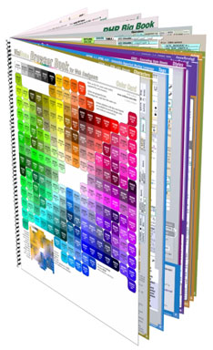
One of my favorite tools for the past couple of years has been a web developer’s reference guide from Visibone. The book has rarely left my desk, within arm’s reach, to help out when I just can’t remember all the options for an HTML tag or a CSS style. While there are some great online references, having it all in a couple sheets of paper makes it easy to find what I’m looking for (especially if I couldn’t remember if it was text-something or font-mumble) and the reference has also let me browse around the dusty corners and learn something I didn’t know.
Recently, I did some web development using XHTML 1.1 and CSS 2.1 and realized my 2004 version of the guide was getting out of date. I was pleased to see many of the pages had been updated to a 2009 version. After reviewing the many options, I chose to go all in and bought the Everything Book, a step up from my earlier version. This one includes cheatsheets for PHP, MySQL, JavaScript, DOM, HTML, CSS, HTML special characters, web colors and a great index. The reference not only includes broad coverage of each topic but many side notes and compatibility guides (for CSS, the IE-Netscape-Opera-FireFox-Safari compatibility color coding is tremendously useful!)
There are a number of bonus references available on the Visibone site at no cost. Check out the color lab, the color swatches for many of the common graphics programs, the online color codes reference, and excerpts from all of the various reference materials. In addition to reference book, Visibone offers posters, charts and mouse pads. The web site is worth a visit; it’s charmingly quirky, retro, opinionated and clearly individualistic.
Semantic markup and styling of data entry forms, IE falls short
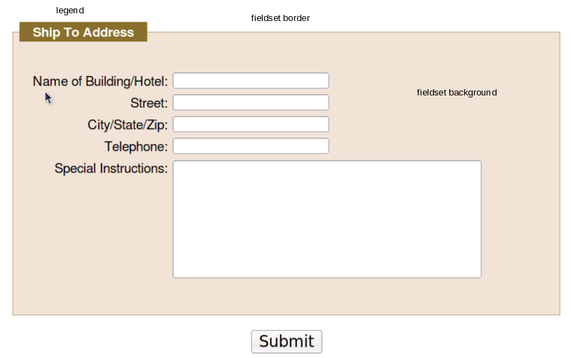
Somehow, in my 10 years of working with HTML, I had missed the fieldset and legend tags. I’ve just started in on a web site redesign where they can be used to great effect and nice semantic markup. The fieldset tag is intended to be used as a container for grouping related input items in a form. By default, the fieldset has a transparent background and a thin black outline around the fields. The fieldset can contain a legend tag that appears by default in the upper left corner of the black outline as a title for the grouping. Both elements can be be modified with CSS styles to match and complement the rest of the page design. Here’s the basic HTML snippet:
<form...>
 <fieldset><legend>Ship To Address</legend>
 <br clear="all" />

 <label for="Building_or_Hotel">Name of Building/Hotel:</label>
 <input type="text" id="Building_or_Hotel" size="25" maxlength="50" />
 <br clear="all" />
...
</fieldset>
And the applicable CSS to make the form look pretty includes:
/* Styles for legends, the title atop the fieldset */
.dataform legend {
 background-color:rgb(137,111,43);
 color:white;
 font-weight:bold;
 margin-left: 0.5em;
 padding:0 1em 0 1em;
 }
/* Fieldset groups a set of inputs in a visual container */
.dataform fieldset {
 border-color:rgb(137,111,43);
 border-style:solid;
 border-width:1px ;
 background-color: rgb(93%,89%,78%);
 }
Results in a data entry form that looks like this:
Using CSS to add visual effects to the elements can yield some pretty sharp results while still having the speed and minimal bandwith of lightweight HTML and CSS text files. In addition, using the semantic fieldset and legend elements provides additional information about the form fields and their relationships in a machine-readable format, rather than just splattering a bunch of colored div boxes and styled text on the form. This is a great aid to tools used by the vision-impaired to provide more context to their users, and to search engines trying to derive the context of your forms.
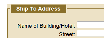
Compatibility between different browsers is not too bad, though things could improve a bit. FireFox 3.5x, Chromium 4.0.285.0 (on Fedora, thanks, Spot!) and Safari 4.x appear dead-on the same (the screenshot above is FireFox 3.5.5), but there is an outlier and no one should be surprised to discover it’s Internet Explorer. Even in version 8, perhaps the most compatible browser Microsoft has shipped since the now-legendary IE5.5/Mac, things are just different. For some reason, the IE8 developers decided that the background color of the frameset should extend out over the border, to the edge of the legend, resulting in this less attractive appearance instead:
For IE7, the background color doesn’t appear at all, which might actually be better than to have it appear incorrectly. (Update: no, my bad, it just doesn’t like rgb values expressed as percentages.) So the appearance definitely won’t be as sharp for your IE users as for any other browser user. (Yet another reason to encourage your clients, friends, associates, neighbors and strangers on the street to avoid Internet Explorer. We can eliminate it in our lifetimes.) (UPDATE: there are, of course, work-arounds. Here are a few suggestions that might work for you from Sitepoint and CommunityMX and Matt Heerema.)
So, the next time you’re called upon to draw up an HTML data entry form, keep in mind that you can group your elements with fieldsets and use legends to add more contextual information to your design.
Everything You Know About CSS is Wrong! – A review
Authors Rachel Andrew and Kevin Yank almost lost me at “hello” with their book titled, “Everything You Know About CSS is Wrong!” ISBN 978-0-9804552-2-9. I’ve never liked the “Dummy’s Guide” book for the same reason — I’m not a dummy — and I’m fairly confident (and hope my clients are well aware) that my CSS knowledge, while not encyclopedic, is better than average, and I’ve delivered some fairly good web solutions.
However, the first goal of selling a book is to get attention, and the title surely does that. And the opening line of Chapter 1, “The problem with CSS is that CSS is too hard.” Okay, I’m hooked, reel me in. (By the way, you can download the sample chapter 1 & 2 from the SitePoint web site; start at http://www.sitepoint.com/books/csswrong1/)
The reality is that the book shows one of the newest features, now available in all of the current brand of browsers, with the late release of Internet Explorer 8, of table layout options in the display attribute. After years of preaching that HTML table layout is less desirable than CSS layouts, this can be a hard sell, but Rachel and Kevin make a good case that a tabular layout of tables, rows and cells, but rendered from CSS and not HTML, is the best of both worlds. Chapters 3 & 4 show the equivalent layouts of many of the common design problems we run into (and perhaps fall back to using tables) and how they should work both with the new CSS 2.1-complaint browsers and how to fall back gracefully into a degraded but workable layout for earlier browsers. Chapter 5 gets into some very exciting layout possibilities that will be coming in the next couple of years as the CSS3 specification gels.
A big plus for the book is that it is brief: 111 pages you can get through in one or two sittings. The graphics clearly show the developing examples. The code extracts are clear (and all the sample code can be downloaded from the web sites). And the writing is clear and well-edited.
The book is well worth the $29.95 cover price, but keep an eye out around the SitePoint site (and their Twitter feed) to catch one of their frequent discounts.
