Archive | Home Page

Articles to appear on the home page (nearly all)

The Web is about People, if we let it be

I was recently contacted by a company interested in having me consult on their development efforts. As I usually do, I did some background research to figure out who they are and what they do. I was appalled: their web site is one of tens of thousands of generic business sites, pretty but empty. All the buzzterms were there, the generic stock photos of the properly demographically-disparate team meetings, leaning over shiny laptops not wired to anything and pointing to pie charts with no labels. The ‘About Us’ page is filled with slogans and buzz words on how awesome “the team” was, without the single mention of who the team is.  The “Contact Us” page is a generic web-based form, with direct links to “sales@example.com” or “info@example.com.” Want a job? Jobs@example.com or hr@example.com.

What is it “About Us” you don’t understand? If you have a link saying “Who We Are,” you had better be ready to name names. Who are these people and what are they hiding? There’s no excuse for a web site like this. Are these people in the witness protection program? Do these people stand behind what they build? There’s no reputation to worry about losing because they never tell you who they are.

You can have the stiff corporate “Who We Are” of black and white pictures of the “Leadership Team” in suits, “Our Advisors” to name-drop your VCs or Directors, or a more playful site of caricatures and off-beat bios. Kudos go to the sites that include your Twitter and Github accounts, and let folks share their passion for mountain biking, marathons or matchbook collecting. But denying there are people behind your web storefront tells me you’re not proud of who you are, you’re uncomfortable putting yourself out there, or you’ve got something to hide.

And that’s the real problem with a “Who We Are” site like this: the publishers are telling us much more about themselves than they intend. In a customer-facing industry where personal service and attention is a key determinant in the success of the project, they’re stating they are not comfortable with that level of contact.

Food for thought.

Keeping up: theme changes

Astute readers (and I know who you two are!) will notice a change to a newer theme. I’ve switched over to the WordPress Twenty-Eleven base theme, with a few of my own tucks, nips and tweaks. I wanted to check out the new theme and test out the new functionality and keep up with the latest stuff.

Child themes are a piece of cake to create, and a child theme lets me override the original without messing with the original source, so updates will not erase the changes. While they are not so difficult to do manually if you are familiar with the command-line, they are even easier with the plugin One-Click Child Theme.

With the child theme in place, I was able to shorten the gap between the site description (the motto) and the header picture, just by adding CSS to the style.css in the child theme (that’s the cascading part of CSS). I added a paper-curl edge effect based on the work of Craig Buckler, published on Sitepoint.

I was disappointed that my site was not valid HTML5, according to the W3C’s validator site. Category tags used in REL links aren’t standard, so I deleted those. The Creative Commons plugins want to use Dublin Core XML namespaces, and there are issues there I’ve got to clean up. And the “generator” REL tag on the bottom of the page isn’t too standard, either. Overall, though, the pages are relatively clean of excessive markup or poorly-formed structures. Stay tuned as I tweak the last few elements into line.

Git presentation, CentraLUG, 3 May 2010

The Central New Hampshire Linux User Group will meet at its usual place and time, NHTI Library, Room 146, 7 PM – 9 PM. Directions can be found at http://wiki.gnhlug.org/twiki2/bin/view/Www/NHTILibrary.

In keeping with the tradition of 3-letter presentations (CSS, Vim, SQL, er, HTM), I’ll talk abut Git, the distributed version control system. Git was originally developed by Linus Torvalds for the Linux kernel and is licensed under GPL2. It’s become popular in Rails development as well, especially with the hosted site GitHub.com. Similar to Mercurial [Updated link, Ed.] or Bazaar, Git is a DVCS – a distributed (or Decentralized) version control system or revision control system. DVCSes introduce an easier way to work on shared project. We’ll talk about how DVCSes work and Git in particular, look at some of the available references, handy cheatsheets, and sites to host your DVCS.

As always, we’ll have some time for introductions, job postings, folks looking for work, questions and hopefully answers.

Hope to see you there.

Some additional links, besides the ones I posted to the announcement above:

Scott Chacon is the authority on Git. Check out his book, his tweets, his online reference, his PDF, and Why Git Is Better Than X.

The Git wiki is a good source of reference materials.

A great diagram and discuss about using git branches in a real development and production environment.

Notes on ViM

The original vi was written in 1976 by Bill Joy. Vim (Vi Improved) was a rewrite/emulation for the Amiga platform (Fred Fish 591). Vim was written and continues to be maintained by Bram Moolenaar.

Bram talks about the Vim philosophy in “The Seven Habits of Effective Text Editing 2.0,” video at Google by Bram: http://www.youtube.com/watch?v=eX9m3g5J-XA

Efficient Editing with Vim: http://jmcpherson.org/editing.html

Save that file you don’t have rights to (as long as your user has sudo rights):

:w !sudo tee %

Source: http://www.catonmat.net/blog/top-ten-one-liners-from-commandlinefu-explained/

Resources:

One of the most helpful postings I have ever seen on the internet: “Your problem with vim is that you don’t grok vi” http://stackoverflow.com/questions/1218390?tab=oldest#tab-top

References: http://en.wikipedia.org/wiki/Vim_(text_editor)

EPILOGUE: Some additional links provided by CentraLUG participants:

Python with a modular IDE

VOom: Vim Outliner of Markers

The story of vi vs. emacs at paintball, perhaps related to this link or this one.

PySIG notes, 25-Feb-2010: CSS

Six people braved miserably wet weather to attend the February meeting of the Python Special Interest Group, held as usual on the fourth Thursday of the month at the Amoskeag Business Incubator.

We had a brief set of introductions and announcements of upcoming meetings. We hope to host a discussion of PyCon 2010 presentations by PySIG members next month; details to be worked out, stay tuned.

I’ve seen this presentation seven times and I think this was the best. Along with the Introduction to CSS, I added a “sneak peek” preview of HTML5 and CSS3 and discussed the support (finally!) for CSS 2.1 in Internet Explorer 8 and how that meant the leading browsers all had support for some intriguing features as outlined in the SitePoint book, “Everything You Know About CSS is Wrong!” There was lots of give and take with the audience, and a few side trips off-script to cover an issue someone wanted to know more about, and a war story or two. Ben Scott was heckled in abstentia.

Slides can be found at http://www.tedroche.com/Present/2010/css/css.html.

Thanks to Bill for arranging and promoting the meeting, to the Amoskeag Business Incubator for the fine facilities, to Laura and the Hopkinton High girls basketball team fundraiser for the M&M cookies, and to all who attended and participated.

Visibone, a source of great reference guides and online utilities

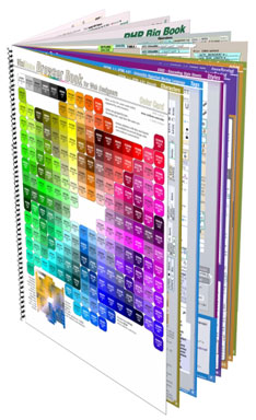
Visibone's Everything Book
One of my favorite tools for the past couple of years has been a web developer’s reference guide from Visibone. The book has rarely left my desk, within arm’s reach, to help out when I just can’t remember all the options for an HTML tag or a CSS style. While there are some great online references, having it all in a couple sheets of paper makes it easy to find what I’m looking for (especially if I couldn’t remember if it was text-something or font-mumble) and the reference has also let me browse around the dusty corners and learn something I didn’t know.

Recently, I did some web development using XHTML 1.1 and CSS 2.1 and realized my 2004 version of the guide was getting out of date. I was pleased to see many of the pages had been updated to a 2009 version. After reviewing the many options, I chose to go all in and bought the Everything Book, a step up from my earlier version. This one includes cheatsheets for PHP, MySQL, JavaScript, DOM, HTML, CSS, HTML special characters, web colors and a great index. The reference not only includes broad coverage of each topic but many side notes and compatibility guides (for CSS, the IE-Netscape-Opera-FireFox-Safari compatibility color coding is tremendously useful!)

There are a number of bonus references available on the Visibone site at no cost. Check out the color lab, the color swatches for many of the common graphics programs, the online color codes reference, and excerpts from all of the various reference materials. In addition to reference book, Visibone offers posters, charts and mouse pads. The web site is worth a visit; it’s charmingly quirky, retro, opinionated and clearly individualistic.

Semantic markup and styling of data entry forms, IE falls short

Somehow, in my 10 years of working with HTML, I had missed the fieldset and legend tags. I’ve just started in on a web site redesign where they can be used to great effect and nice semantic markup. The fieldset tag is intended to be used as a container for grouping related input items in a form. By default, the fieldset has a transparent background and a thin black outline around the fields. The fieldset can contain a legend tag that appears by default in the upper left corner of the black outline as a title for the grouping. Both elements can be be modified with CSS styles to match and complement the rest of the page design. Here’s the basic HTML snippet:

<form...>
 <fieldset><legend>Ship To Address</legend>
 <br clear="all" />

 <label for="Building_or_Hotel">Name of Building/Hotel:</label>
 <input type="text" id="Building_or_Hotel" size="25" maxlength="50" />
 <br clear="all" />
...
</fieldset>

And the applicable CSS to make the form look pretty includes:

/* Styles for legends, the title atop the fieldset */
.dataform legend {
 background-color:rgb(137,111,43);
 color:white;
 font-weight:bold;
 margin-left: 0.5em;
 padding:0 1em 0 1em;
 }
/* Fieldset groups a set of inputs in a visual container */
.dataform fieldset {
 border-color:rgb(137,111,43);
 border-style:solid;
 border-width:1px ;
 background-color: rgb(93%,89%,78%);
 }

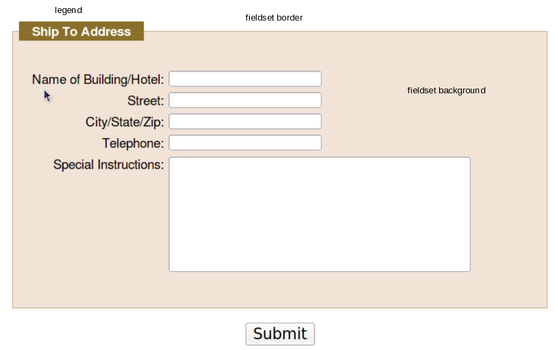
Results in a data entry form that looks like this:

HTML form layout with fieldset and legend tags

Using CSS to add visual effects to the elements can yield some pretty sharp results while still having the speed and minimal bandwith of lightweight HTML and CSS text files. In addition, using the semantic fieldset and legend elements provides additional information about the form fields and their relationships in a machine-readable format, rather than just splattering a bunch of colored div boxes and styled text on the form. This is a great aid to tools used by the vision-impaired to provide more context to their users, and to search engines trying to derive the context of your forms.

Compatibility between different browsers is not too bad, though things could improve a bit. FireFox 3.5x, Chromium 4.0.285.0 (on Fedora, thanks, Spot!) and Safari 4.x appear dead-on the same (the screenshot above is FireFox 3.5.5), but there is an outlier and no one should be surprised to discover it’s Internet Explorer. Even in version 8, perhaps the most compatible browser Microsoft has shipped since the now-legendary IE5.5/Mac, things are just different. For some reason, the IE8 developers decided that the background color of the frameset should extend out over the border, to the edge of the legend, resulting in this less attractive appearance instead:

IE8 fieldset background colors overflow the border at the top.

For IE7, the background color doesn’t appear at all, which might actually be better than to have it appear incorrectly. (Update: no, my bad, it just doesn’t like rgb values expressed as percentages.) So the appearance definitely won’t be as sharp for your IE users as for any other browser user. (Yet another reason to encourage your clients, friends, associates, neighbors and strangers on the street to avoid Internet Explorer. We can eliminate it in our lifetimes.) (UPDATE: there are, of course, work-arounds. Here are a few suggestions that might work for you from Sitepoint and CommunityMX and Matt Heerema.)

So, the next time you’re called upon to draw up an HTML data entry form, keep in mind that you can group your elements with fieldsets and use legends to add more contextual information to your design.

“Web Form Design: Filling in the Blanks” – a review

WebForms book cover

Title: Web Form Design: Filling in the Blanks

Author: Luke Wroblewski

ISBN: 978-1-933820-24-8

Published by Rosenfeld Media, 2008

In the nineties, I used to do a lot of presentations at conferences of computer programmers. I used to enjoy doing “concept” presentations; not so much focusing on “how-to” as to “why” and “what” to do. When I set the audience’s expectations correctly that they were going to be exposed to new concepts, I got a good reception. When I failed to make that point clear, I would inevitably get comments in my speaker’s review of “Great idea, but where’s the code?”

If you’re looking for the code, look elsewhere. This is not the book for you. If you are looking for the concepts, the big ideas behind user interaction on the web, how to get information from the browser, how to successfully convert the most browsers into customers, why different alignments might make a difference in accuracy, speed and satisfaction in filling out forms, this is the book for you. Luke Wroblewski is an experienced professional in the field of HCI (“Human-Computer Interaction”) or UX (“User Experience”) with some impressive industry experience. This book shows a thoughtful approach to “how do I get people to fill out a form, quickly, pleasantly, correctly?”

So as not to get lost in the weeds of HTML vs. XHTML and CSS 1, 2, 2.1 and 3 varying levels of compliance, Luke talks forms purely from the user standpoint: we see excellent cropped screenshots of forms, focused on the individual elements under discussion. (Rosenfeld Media has done an excellent job of producing a beautiful book: heft, thick pages, rich colors and fine printing.) The book is divided into three sections: Form Structure, Form Elements, and Form Interaction. Each section assumes some base knowledge, thankfully, and doesn’t start out trying to explain why you’d use a checkbox vs. a radio button. And he’s frank that there rarely is One True Answer (at one point, calling out, “All together now: ‘It depends'”) but talks about empirical testing of speed, correctness, and the results of studies monitoring user’s eye movements, pauses and mouse movements to determine which layouts work and which confuse.

If you spend a lot of time designing forms, the 215 pages of this book are well worth a read, and don’t be surprised if you find yourself going back to the book for a refresher.

One of those days…

It took 4 ThinkPads, 3 DVDs, two CDs, a Flash Drive and an iMac to make it through the day. No partridge. Tomorrow, five golden rings?

The Thinkpads: T61 is the primary workstation, but was suffering from SMART-reported disk drive errors and I spent half the day following the awesome instructions for bad block HOWTO for smartmontools to rescue the disk. In the meantime, the T41 served as backup workstation letting me surf, check email, etc. In the afternoon, the A31p has a legacy WinXP/IE7 install I can VNC into to test a client project. Meanwhile, I was also working on the Lenovo ThinkPad W700 to finally fix the running-out-of-disk-space problem thanks to System Restore, now disabled (thanks, System Restore! pffft!). Why do people keep using Windows?

The three DVDs were to burn the System Restore disks once there was a machine worth restoring.

The two CDs were something old and something new. I tried a Knoppix 5.11 CD to boot the W700 so I could do a partimage copy of the Vista OS partition where we’ve installed custom software for client testing. For some reason, the older Knoppix couldn’t handle the hardware and would fail to start. I grabbed the latest Knoppix, 6.2 (make sure you grab the November 18th or later image) and – whoa! – what a difference. The 6.x series is based on different software and uses LXDE as the default desktop — very slick!

I used the iMac to burn the CD. The most recent software on the T61, Fedora 11, seems to be confused about whether I have a CD-R on the machine or not, and I haven’t been able to burn a disk for a while.

I used the second CD (in the T61) to burn an image onto a 1Gb USB Flash drive . The Knoppix 6.2 comes with a built-in option to create the USB with a mouse click or two. It boots fast, has 284 Mb left over to preserve settings, and boots in the W700.

Notes from NH Ruby/Rails group, 17-Nov-2009, rvm and EC2

Brian Turnbull and Nick Plante each had excellent presentations for the New Hampshire Ruby Rails Group’s first meeting on the third Monday of the month, our new “regular meeting day.” (We won’t be having a December meeting, however; have a happy Kwanzaa, Hanukkah, Christmas, Saturnalia, Winter Solstice or non-denominational generic shopping holiday of your choice.)

Brian was up first, and talked about rvm, the Ruby Version Manager (slides here: http://www.slideshare.net/bturnbull/rvm-nhruby-nov-2009). RVM doesn’t just allow you to have multiple versions of ruby on your machine; you’ve always been able to do that with side-by-side installs or linking or aliases or other kludges. RVM can be found at https://rvm.io/ and can be installed as a Gem, from the Git repository or as a tarball. It’s not Ruby code, actually, but shell scripts, and it allows not just switching of the current active version of ruby, but much more interestingly, the entire set of gems associated with a version! Multiple gemsets can be assigned an alias that lets you group your gems by function or project or client. RVM also provides a facility to dump the list of gems from one version or gemset and load it into another, allowing you to test out the migration of an existing system to a new version with much less hassle. Finally, rvm also lets you invoke multiple versions serially, passing them a command like “rvm 1.86, 1.8.7, 1.9.1 rake spec” where rvm will run all your tests on multiple versions and report results, even in JSON if specified. This could be the core of a really simple Continuous Integration (CI) server in a single line of code!

Brian cautioned that rvm is early in its development cycle (current as of last night was 0.0.79) and changes are coming fast and furious, but it’s worth taking some time to keep track of this very interesting development!

Brian also mentioned that rvm has some extensions to work with Bundler. Nick mentioned that Bundler, a project from Yehuda Katz (core contributor to both Ruby and jQuery) , is slated to become the default means of managing gems in Rails 3.0. Here’s a good link to learn more: http://yehudakatz.com/2009/11/03/using-the-new-gem-bundler-today/

Nick Plante was up next, with his presentation on EC2 for Rails Development (http://zapnap.github.com/presentations/ec2-rubber/#0). Nick talked about the evolution of deployment of Rails (or Rack) solutions, moving from very painful to much easier with the introduction of Capistrano (http://www.capistranorb.com/). He reviewed how simple it was to deploy an application with Capistrano, and then talked about the power of the Amazon Web Services (AWS) http://aws.amazon.com/ and Cloud Computing in general. Capistrano is focused on general deployment to a server, but the new add-on, Rubber (http://github.com/wr0ngway/rubber),  extends that to work with elastic computing resources like AWS’ Elastic Compute Cloud (EC2). We walked through the basics of the install-configure-deploy scenario and then “Insert Demo Here.” – he did it. Defying the Demo Gods (who had already tortured Brian a bit), Nick grabbed a copy of RedMine (http://www.redmine.org/) from GitHub, did the couple of minor configuration items needed to make it work locally (creating the session key, copying the sample database config to the live one, setting it to use SQLite3 locally and running db:migrate) and then set it up for deployment: first invoking Capistrano (doing some configuring) and then Vulcanizing (how else would you make rubber) the installation, then deploying it to a brand-new AWS instance. The steps flew by lightening-fast: the Amazon instance was up and running a minute after being invoked, then took a couple of minutes to install and configure Apache, Passenger, MySQL, the Redmine application, and sftp the development directory files to the instance. Within a few minutes, Nick could browse the machine and see the running application as well as ssh into the box and make any changes. There are innumerable options, of course, but they are all accessible by reviewing the configuration files and the source to tune it to your particular needs.

While we waited for the installation to complete, I brought up some of the customer’s concerns and practitioner’s insights from last Thursday’s MonadLUG meeting on Cloud Computing and we talked about how those applied. I expressed concerns about how persistent data storage worked, since the cloud images were considered ephemeral. Nick pointed out that the instance, while running could have a local database and it could be in a master-slave replication arrangement with either another instance (within the AWS, there aren’t bandwidth charges) or a hosted or local machine. Also mentioned was the Amazon Relation Database Service (RDS), which can provide a MySQL database instance with backups. So, there are lots of options.

Thanks to Brian and Nick for excellent presentations as well as organizing the meeting and bringing the pizza, to Tim and the folks at RMC Research for providing the excellent facilites and to all eleven who attended and participated in the meeting.

Remember, no Ruby meeting meeting in December. Stay tuned for a January announcement.
Powered by WordPress. Designed by Woo Themes

This work by Ted Roche is licensed under a Creative Commons Attribution-NonCommercial-ShareAlike 3.0 United States.